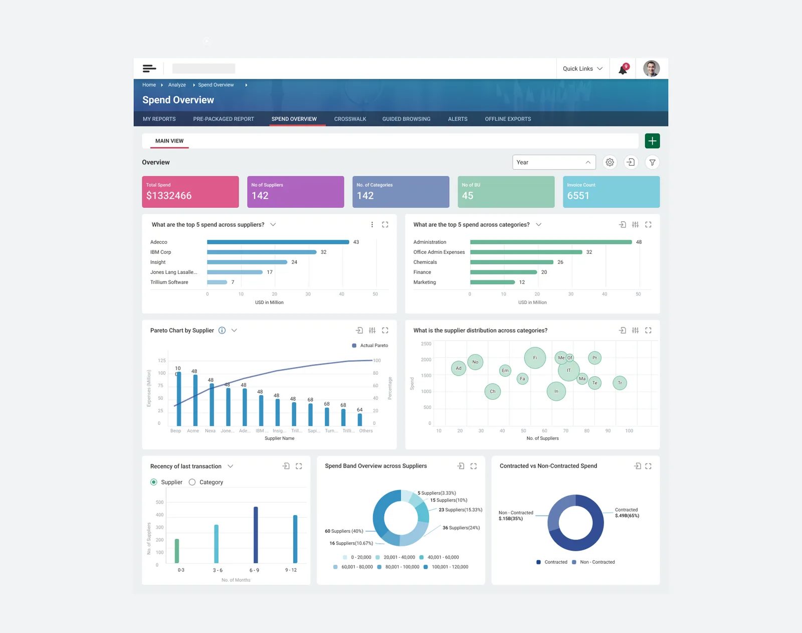
A dense enterprise analytics platform, made readable by people whose job title isn't analyst.
Spend analytics is genuinely complex. A large enterprise has hundreds of suppliers, dozens of categories, tens of thousands of invoices, and spend distributed in ways nobody can hold in their head.
The category manager who needs that picture is not an analyst. They will not build a pivot, choose a chart type, or interpret a Pareto curve unprompted. But they are the person who has to act on what the data says.
Most enterprise BI resolves this by adding power — more filters, more chart types, more configuration. That serves the analyst and abandons everyone else.
Not "Supplier Spend — Bar." Instead: "What are the top 5 spend across suppliers?" · "What is the supplier distribution across categories?"
It reads as a small copy decision. It isn't. A chart labelled by its type asks the reader to already know why they'd want it. A chart labelled by its question tells a non-analyst what they're about to learn, and — more usefully — teaches them the questions worth asking about their own spend.
The dashboard stops being a set of instruments and becomes a list of answers.
Every widget carries the same affordances in the same positions: expand to full screen, drill into the underlying data, adjust the view, an info icon where the metric needs defining. Learn one card, you've learned nine.
Consistency here is not tidiness. In a tool this dense, a predictable frame is what lets someone explore without fear of getting lost.
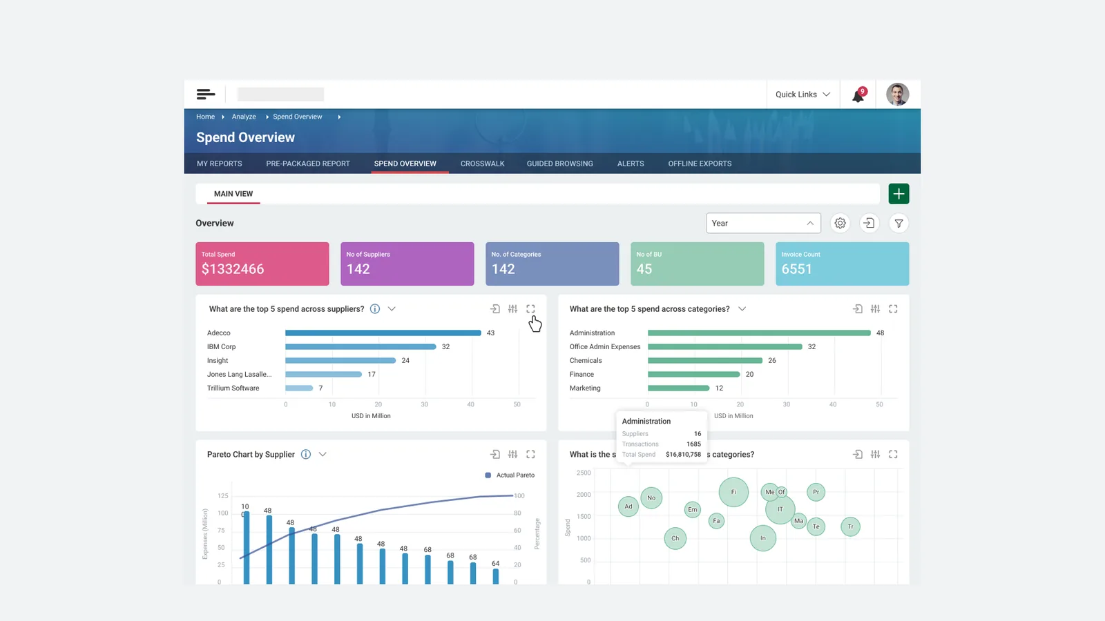
Ranking questions get bars. Concentration gets a Pareto curve. Distribution gets a bubble plot. Composition gets a donut. Recency gets a histogram with a Supplier/Category toggle.
Each form was chosen because it's the right answer to that specific question — not to make the board look varied. The discipline is in refusing the chart types that would have added visual interest and cost comprehension.
Contracted vs Non-Contracted Spend — $.49B against $.15B, 65/35 — sits in the bottom row as a permanent widget.
Non-contracted spend is maverick spend: purchases made outside negotiated agreements. It's the number a procurement function is judged on and the one easiest to leave out of a summary view. Keeping it on the default board, unprompted, is a small act of design taking a position.
The same problem, seen from the other end, is what the Agentic Procurement Platform was later built to prevent.
This is the earliest of the four projects here and, by some distance, the most ordinary. It is an enterprise BI dashboard. The genre is well-trodden and I did not reinvent it.
What it taught me carried into everything after: in enterprise software, comprehension is the constraint, not capability. The hard part was never rendering the Pareto curve — it was making a category manager understand, in four seconds, what it was telling them about supplier concentration.
Every agentic pattern I designed later is the same instinct at a higher altitude. Explaining the policy rule before it applies. Naming agents by procurement role. Showing an AI's reasoning next to its recommendation. All of it is the question-as-a-title decision, made again.