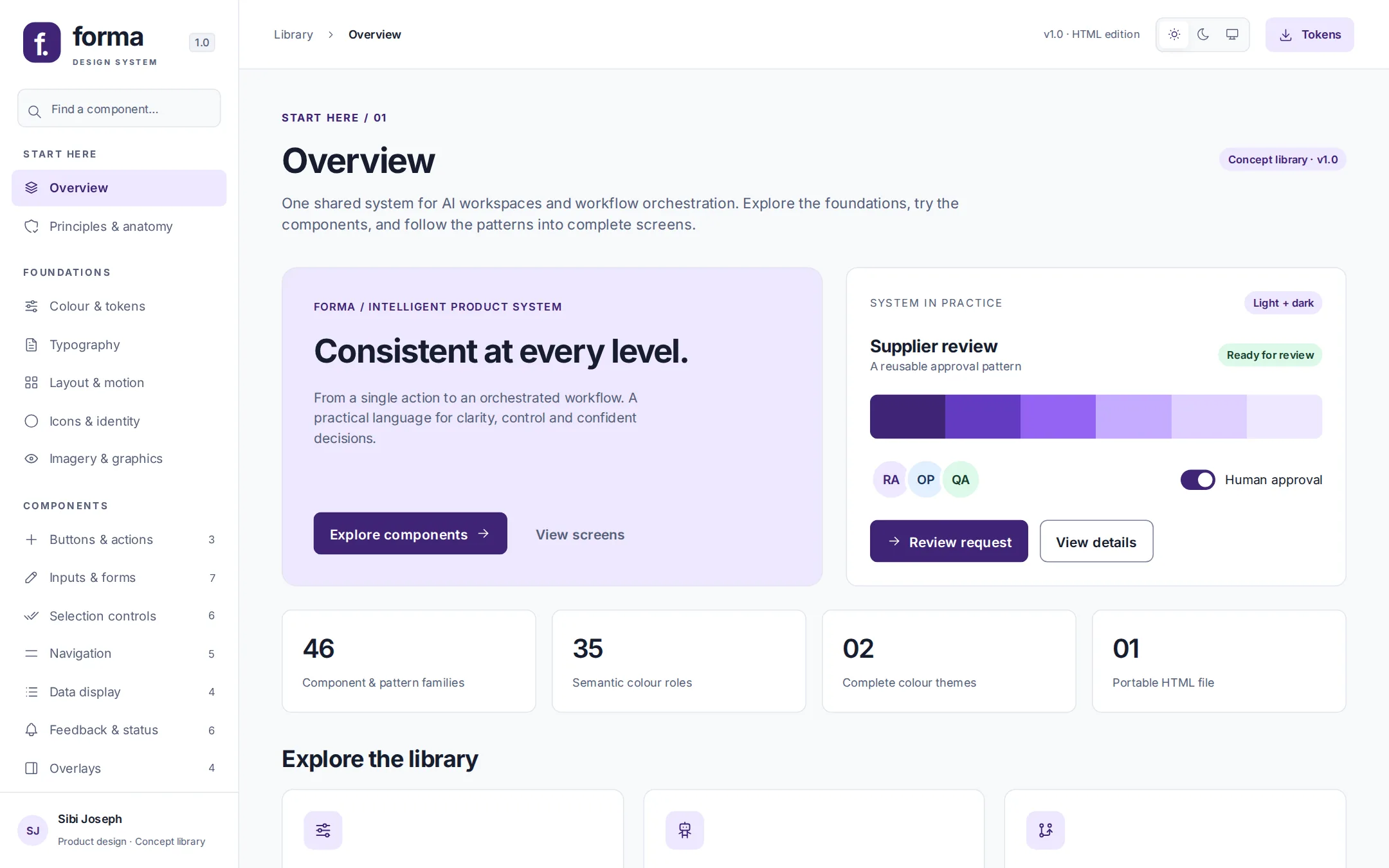
Forma asks what one system would look like underneath agentic products, so that asking, delegating, configuring and approving all speak the same language.
AI workspaces and workflow tools combine very different tasks: asking a question, choosing a specialist, configuring a process and approving an action. Left alone, each one grows its own conventions.
I met that problem in the two agentic case studies on this site, the procurement platform and the workflow builder. Forma started from their patterns: prompt entry, role-based agents and task cards on one side; workflow cards, filtering, activation, flow preview and run status on the other.
It isn't an extraction of either product. It's a self-initiated study of the system that could sit underneath both. It has its own identity, fictional names and illustrative data, which keeps it independent of any company's branding.
A question is cheap to get wrong. An approved action isn't. The same button, badge or card has to read correctly in both, without making the harmless feel dangerous or the consequential feel casual.
Hover, focus, pressed and disabled describe the control. Active, paused, draft and review required describe the work. When the two share a vocabulary, a paused workflow starts to look like a disabled button.
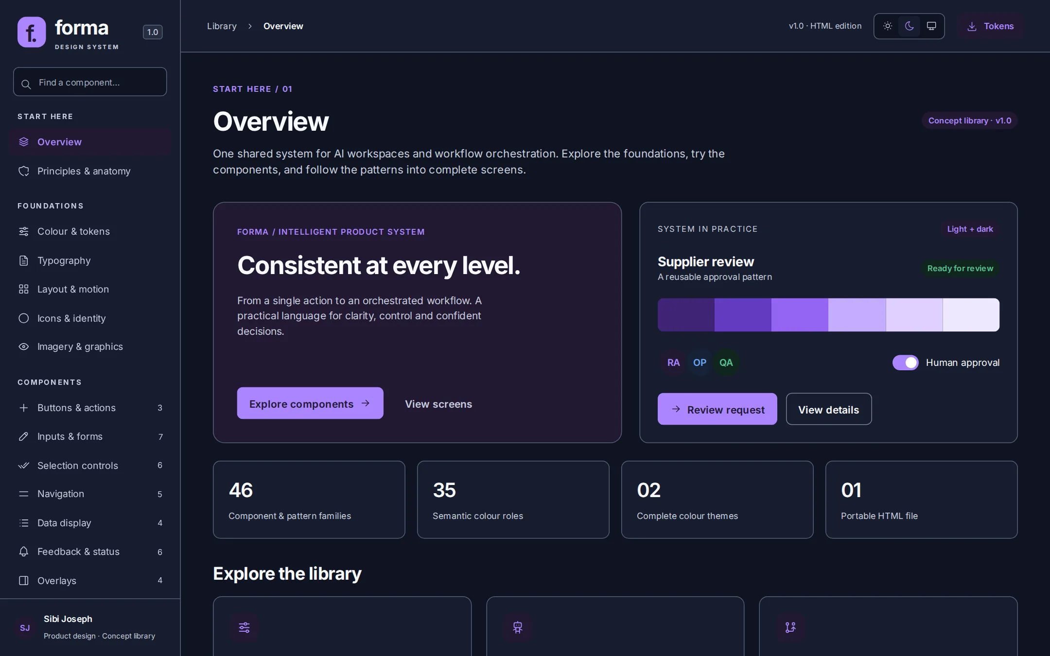
Dark mode had to be a second resolution of the same roles, not a repaint. If a colour means "primary action" in light, it has to mean exactly that in dark.
Loading states that invent progress, and answers presented as verified without evidence, are design failures. Honesty had to be the default pattern, not a line in a writing guide.
A system that lives in one designer's file doesn't scale. Every token, component and pattern needed a contract engineering could implement and a Figma library could be rebuilt from.
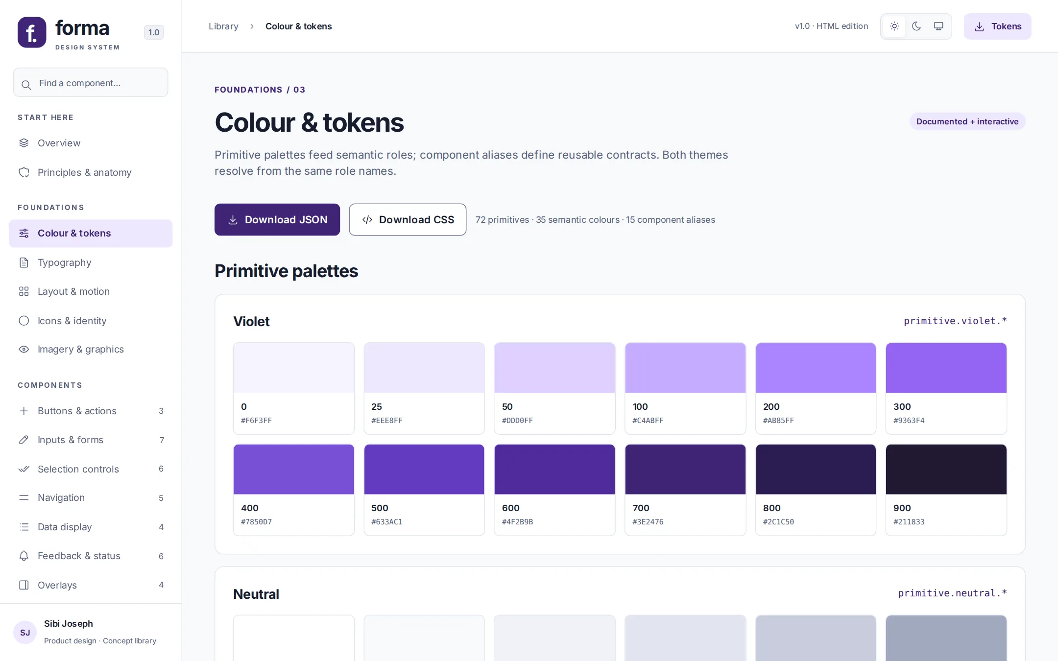
Three layers. Primitives hold the raw palette, semantic roles say what a colour means, and component aliases say where it's used.
primitive.violet.700 → action.primary → button.bg
It sounds like bookkeeping. It's what makes dark mode a setting rather than a project, and what lets a status colour change once instead of in every screen that uses it.
Make the next action, its scope and its consequences visible. Name an action with a verb and an object: "Review request", never a bare "OK".
Show the most useful controls first. Configuration and evidence stay within reach without crowding the primary task.
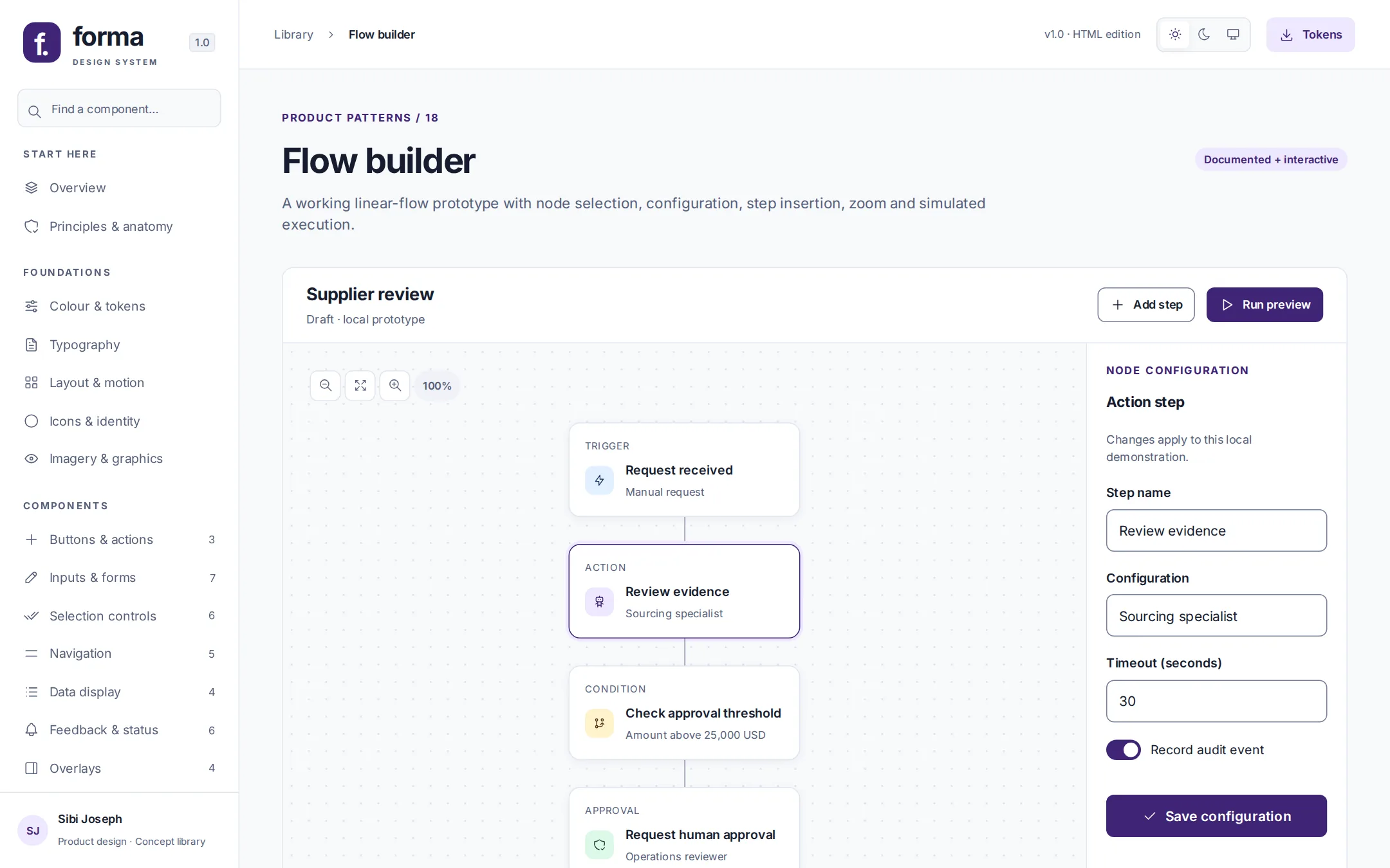
Separate suggestions from execution. Consequential actions need an explicit approval and leave an audit trail.
"I have reviewed the proposed change."
Approve won't proceed until this is ticked. It says why, and moves focus to the checkbox.This is the same position as the agentic platform case study: the agent declares intent, and a human commits. Here it becomes a reusable component instead of a one-off screen. Target, change, scope and reviewer are stated before anything is applied.
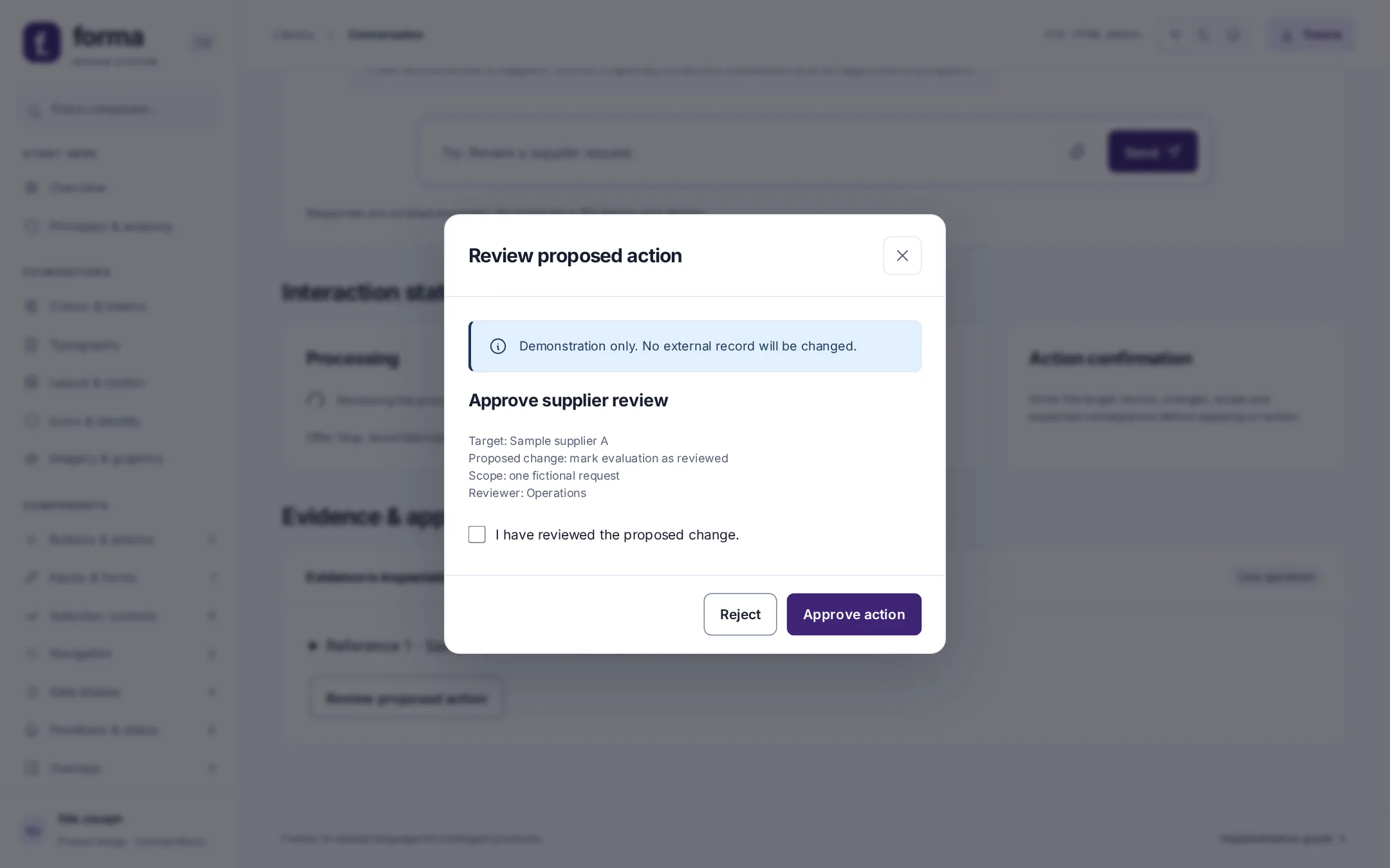
Use the same role for the same meaning in both themes. Success, selection and progress are distinct concepts, and none of them is carried by colour alone.
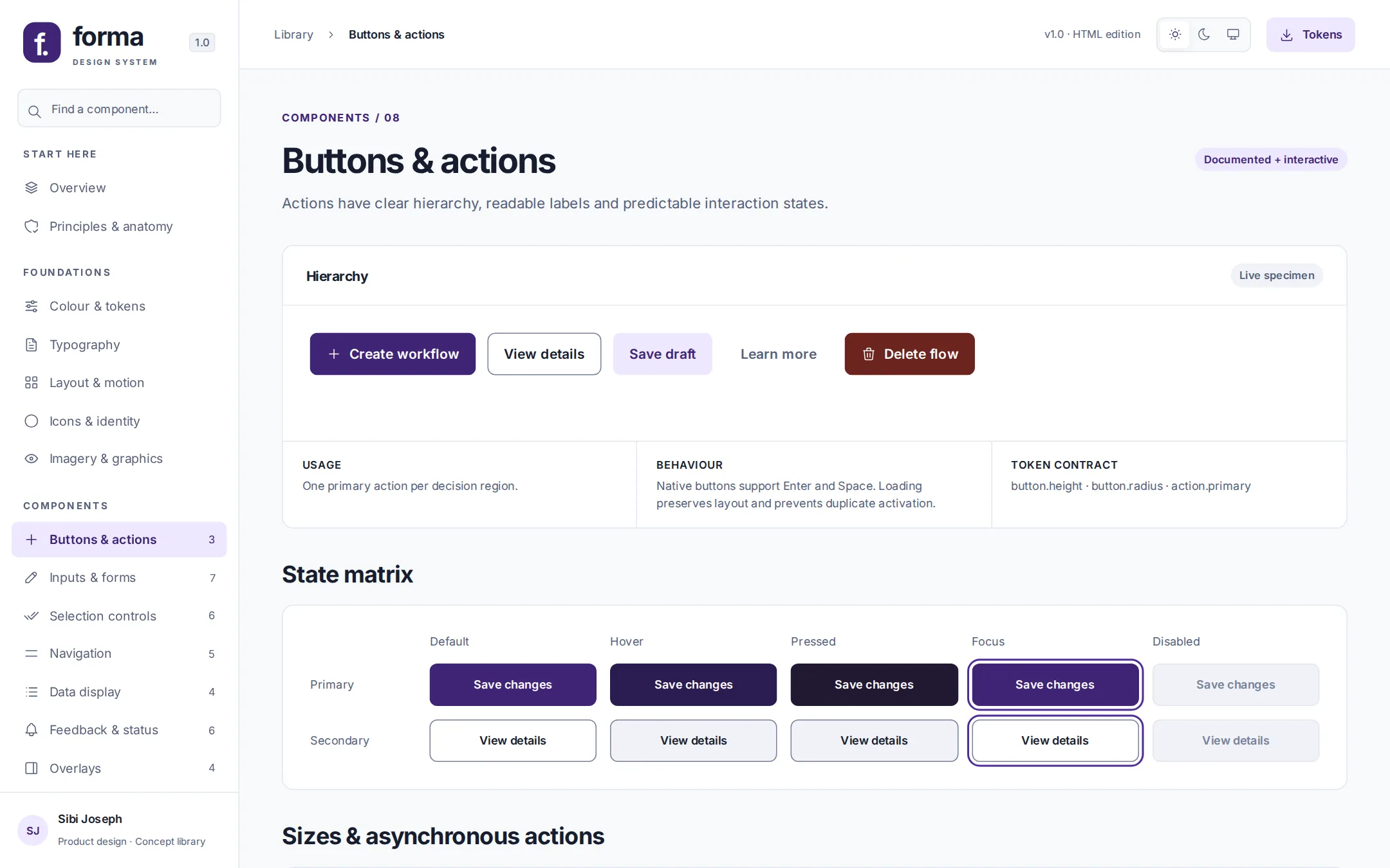
Structure, properties and behaviour are written down for each one. That means container, content and affordances; variant, size, state and slots; and activation, keyboard, focus, validation, loading and recovery.
Processing states offer Stop and never show invented progress percentages. When evidence is missing, the assistant says so: "I don't have enough information to compare these suppliers."
Citations are disclosures the user can expand, not decorative footnotes. The reference comes first, then the decision.
Eight control types have documented keyboard behaviour. Tabs move with the arrow keys, Home and End. Dialogs contain focus, close on Escape and return focus to whatever opened them.
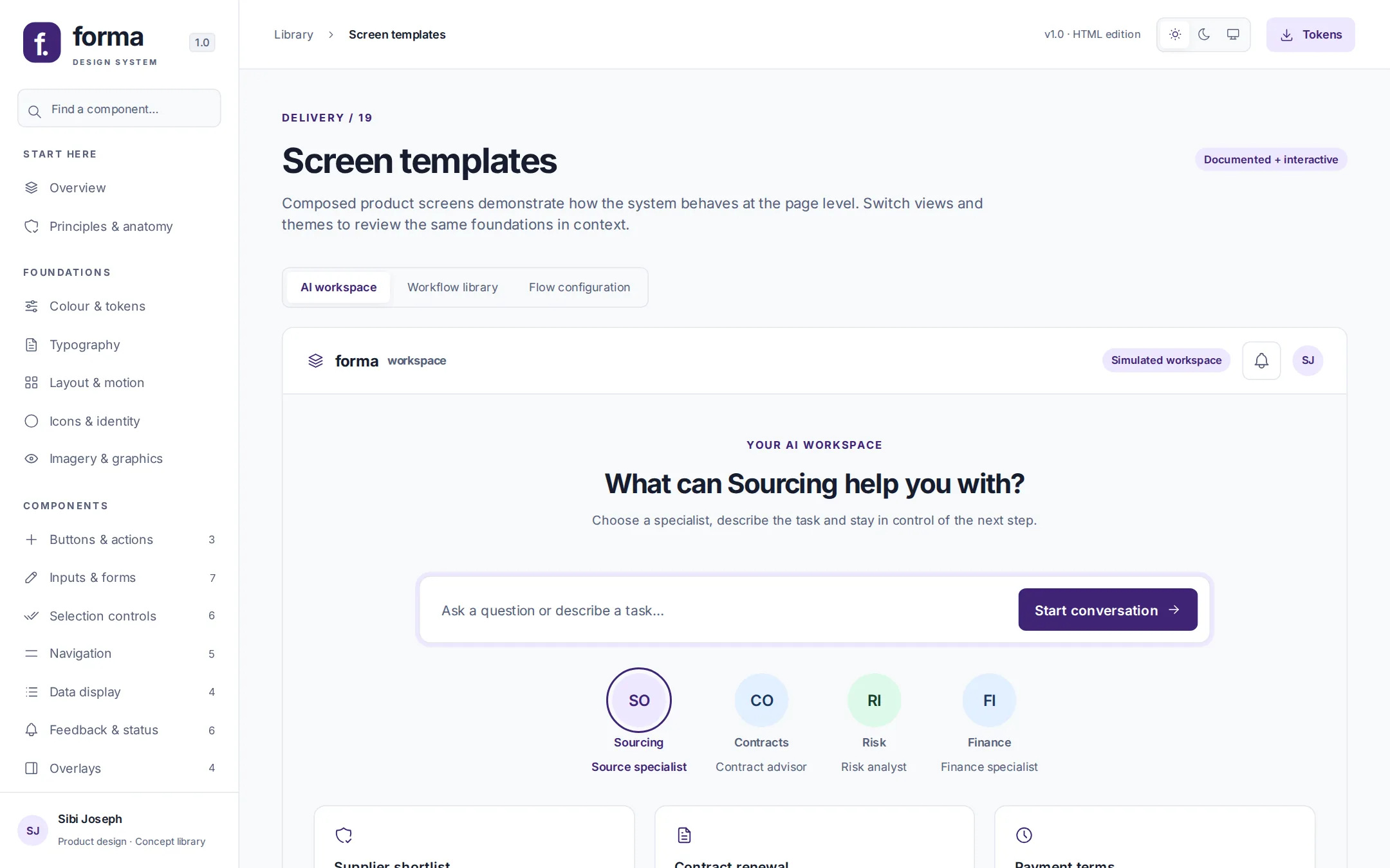
On desktop, navigation and the inspector sit side by side. Tablet collapses navigation but keeps primary actions in place. Mobile stacks the composer and moves the inspector below the canvas.
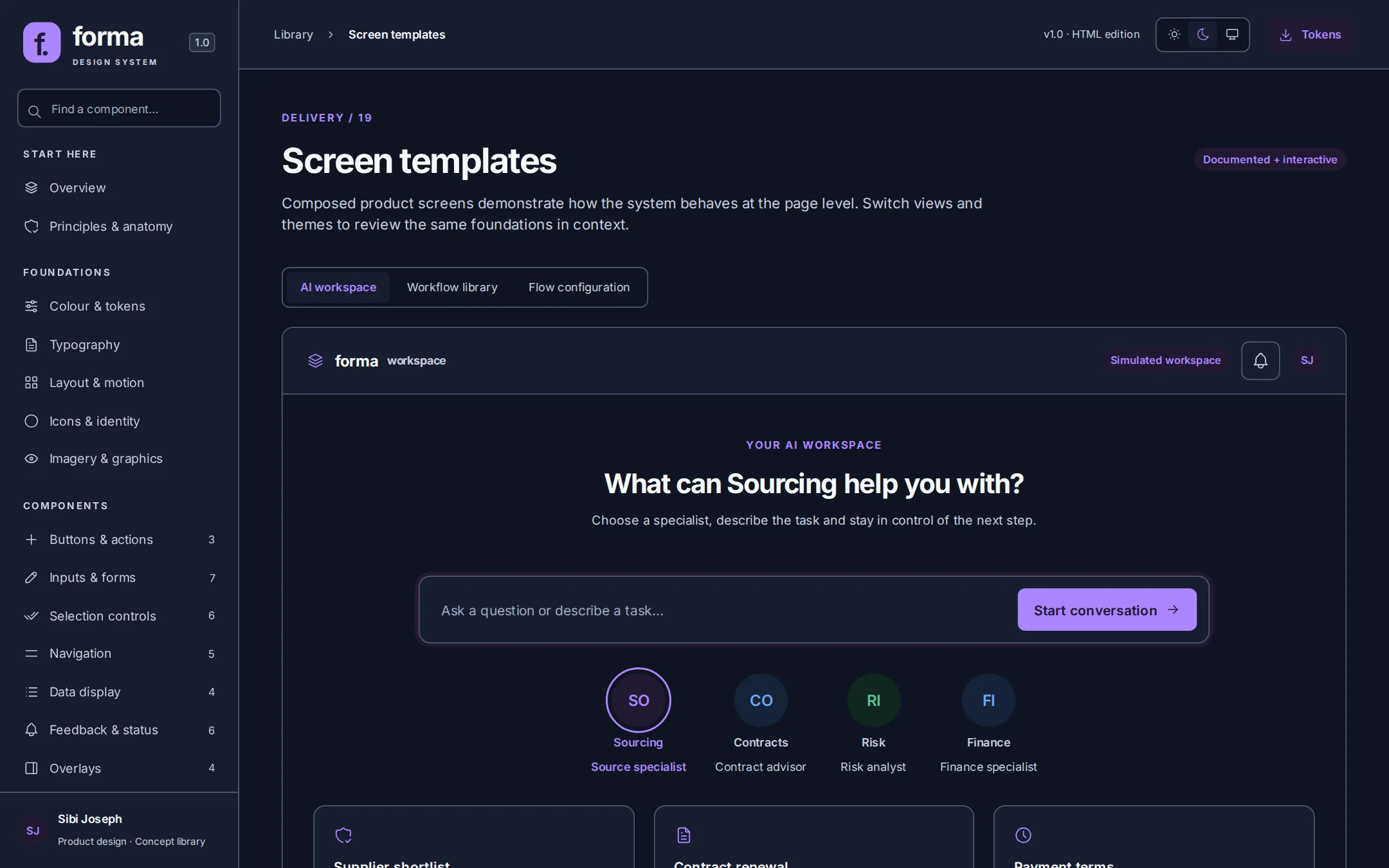
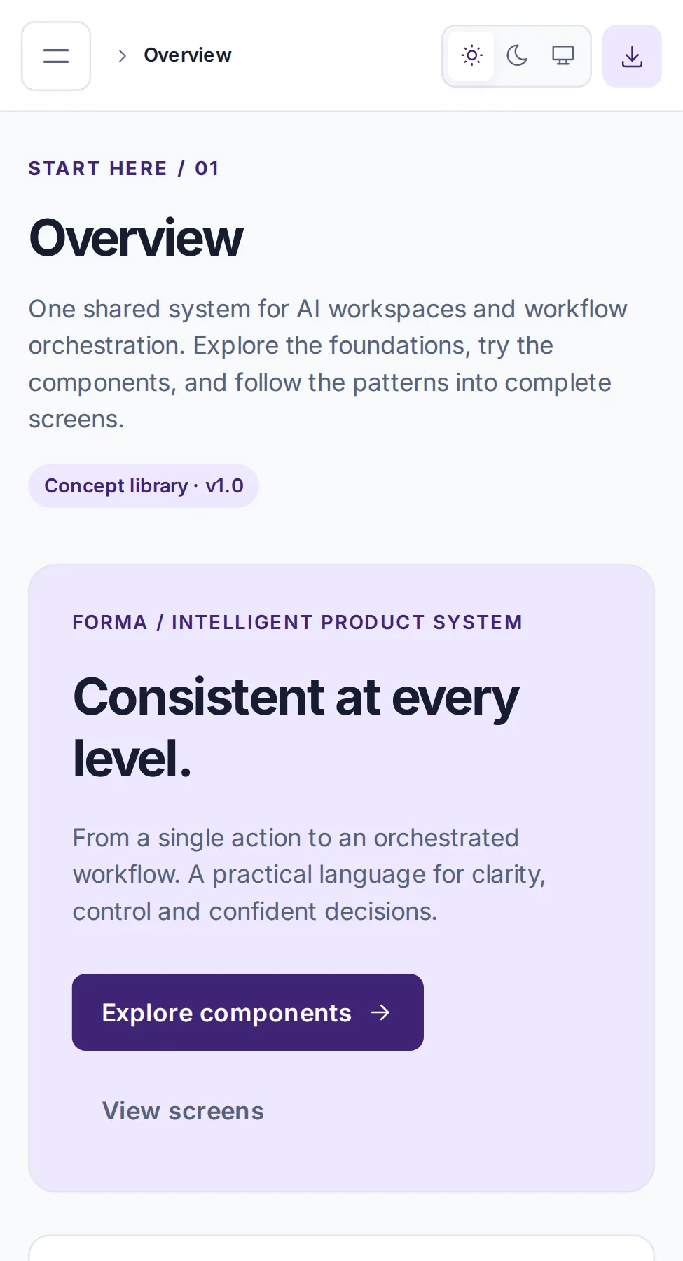
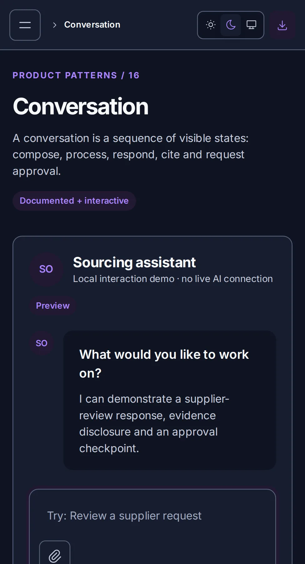
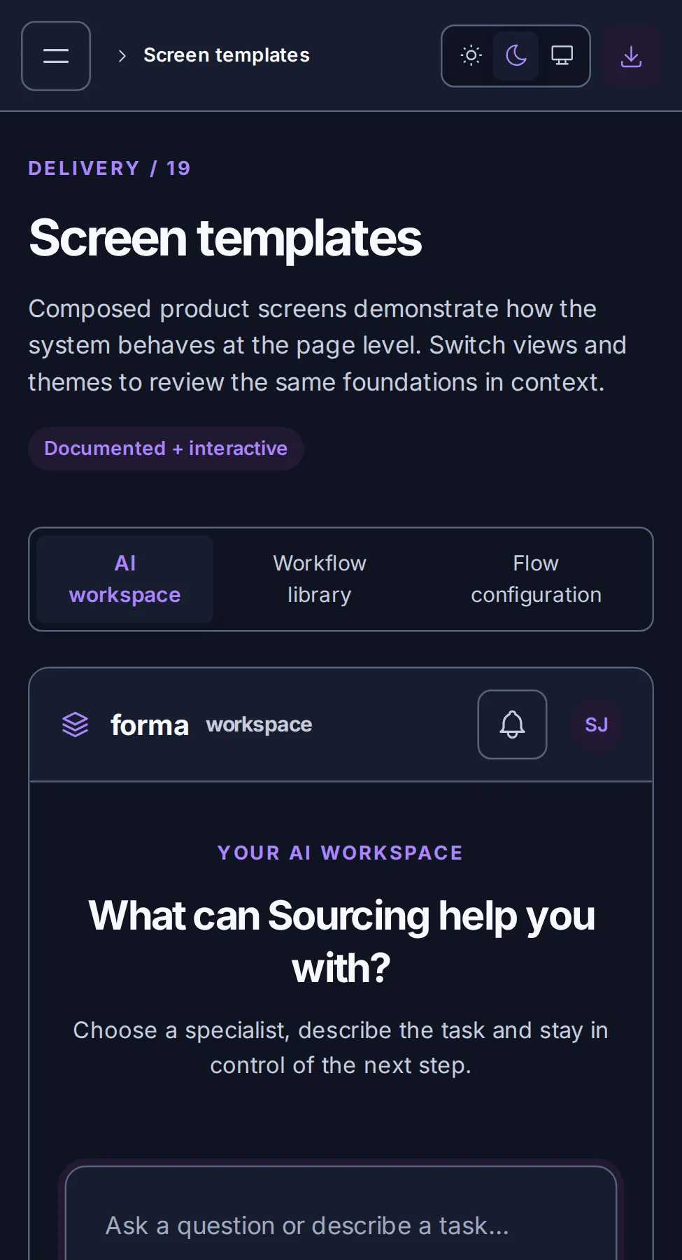
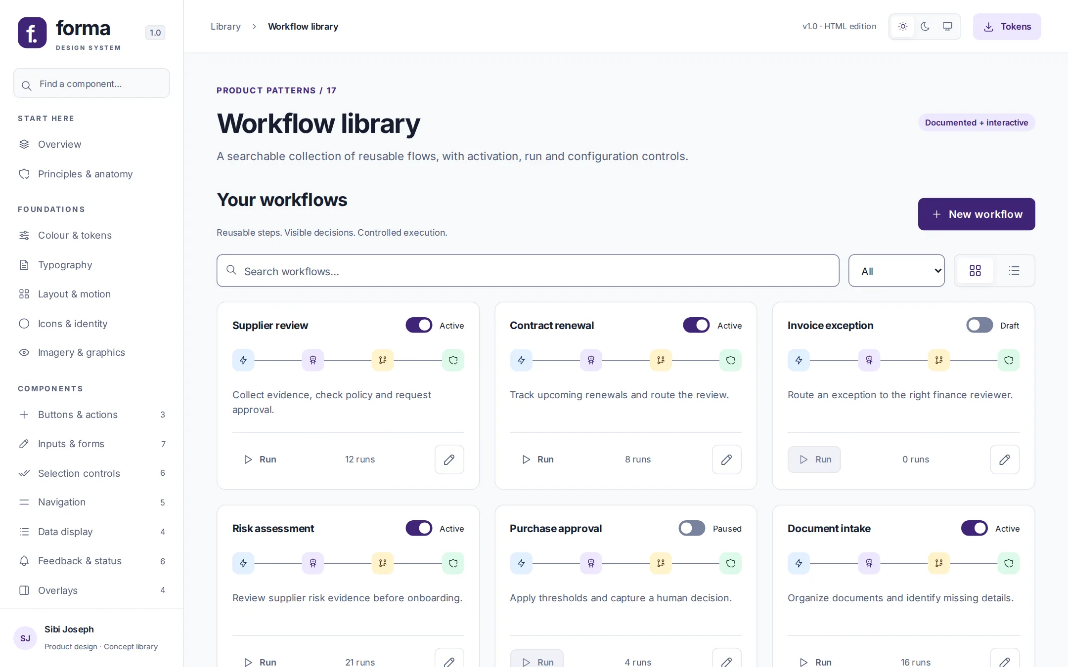
Because every colour is a role, contrast can be verified once, at the tokens, rather than screen by screen.
Every text role (primary, secondary and muted) clears WCAG AA's 4.5:1 on every surface, in both themes. Action and status labels pass on their own backgrounds too.
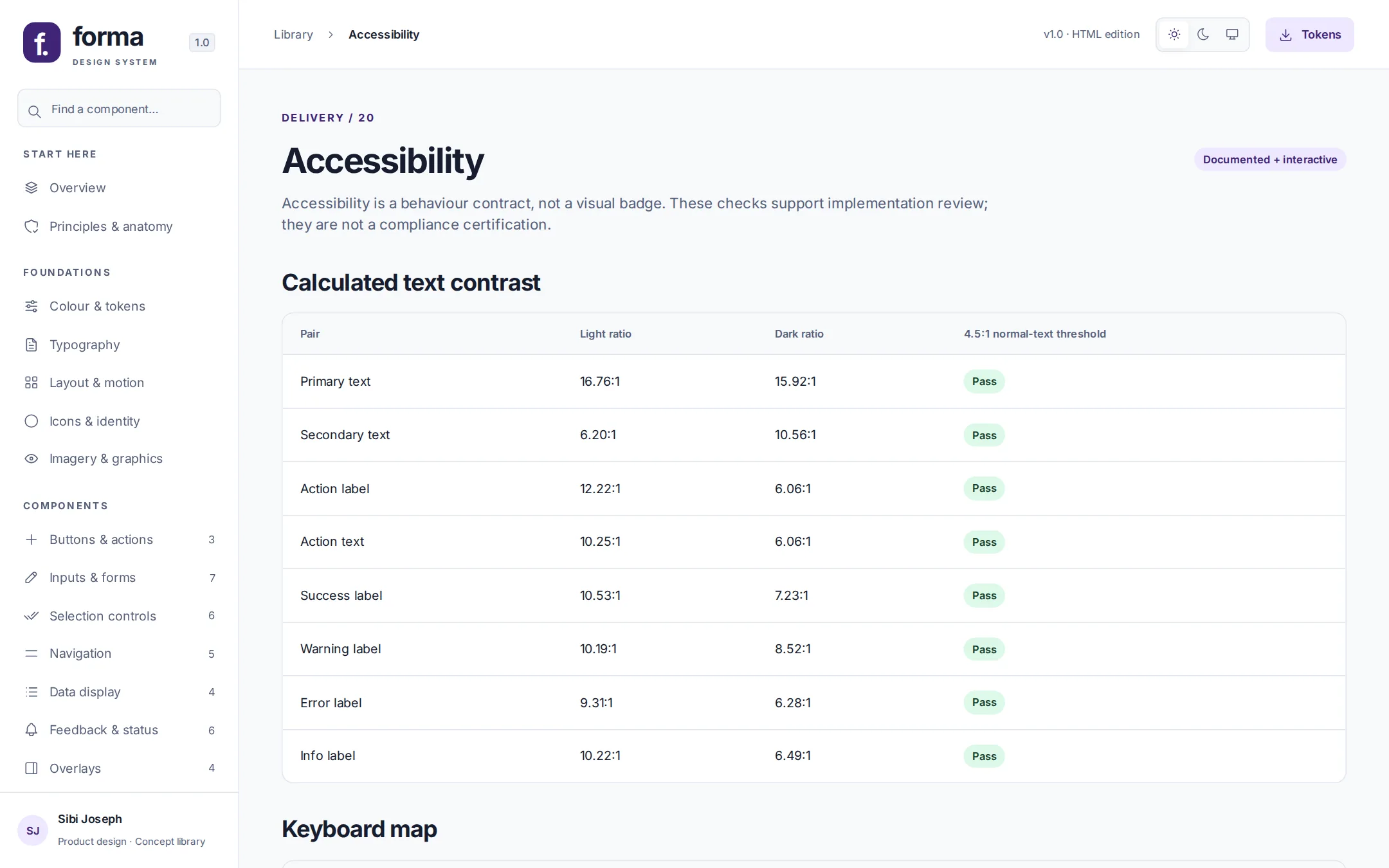
These checks support implementation review. They are not a compliance certification: screen-reader and assistive-technology testing belong to a production build.
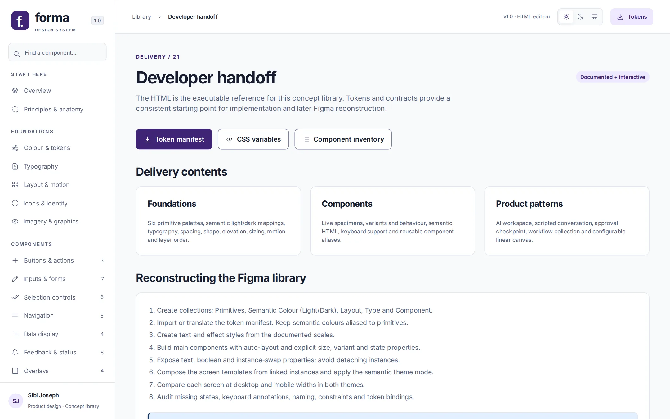
The HTML is the working reference. Everything in it is written so engineering can implement it and a Figma library can be reconstructed from it.
Tokens download as a JSON manifest or CSS variables. Components come with API conventions that engineering can map to their own framework. The handoff page sets out the Figma rebuild: primitive and light/dark semantic collections, auto-layout components with explicit variant and state properties, and screens composed from linked instances.
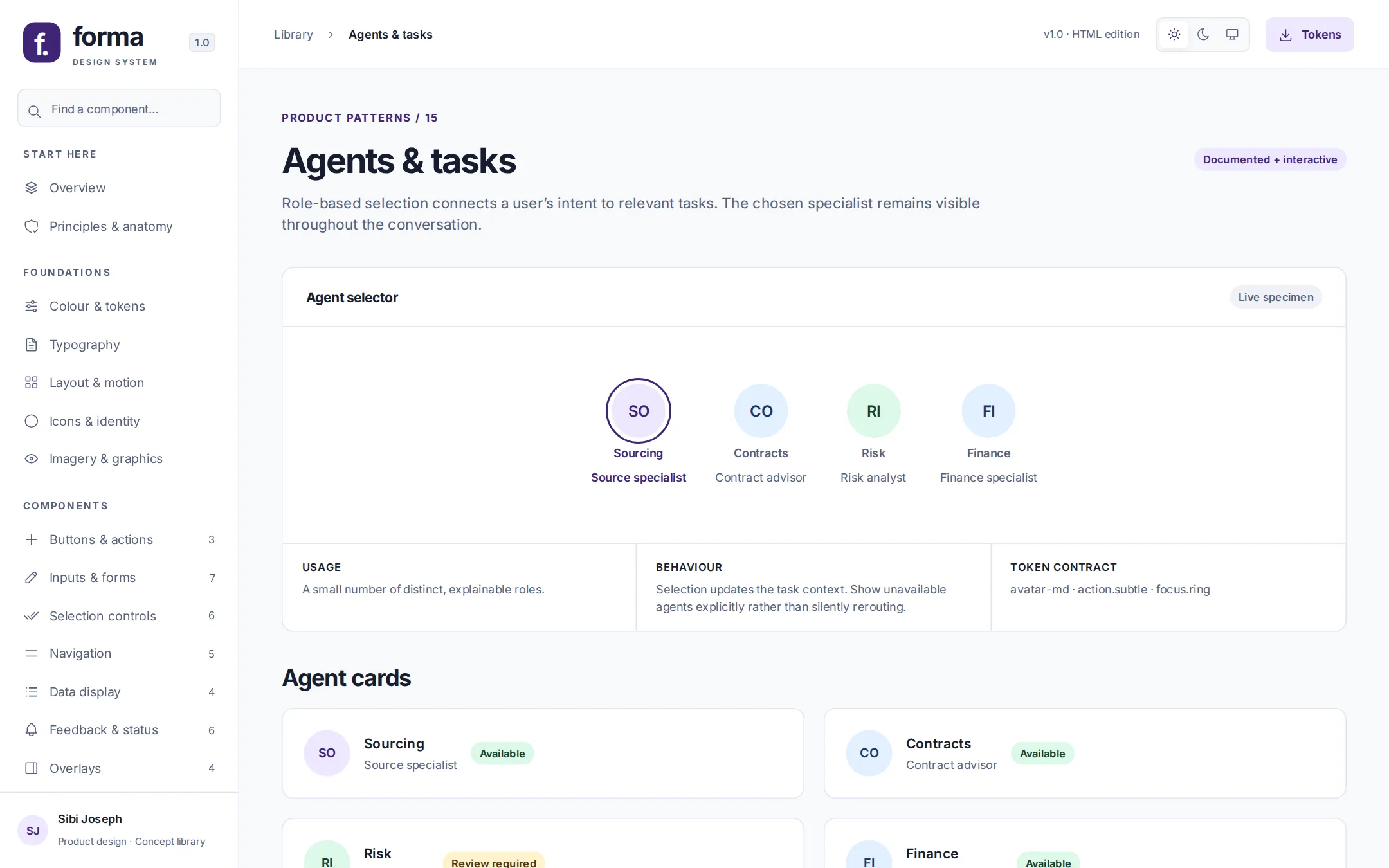
Agent { id, role, capability, availability, selected, pendingActions }
Versioning is written down too. A fix is a patch, a new compatible component is a minor, and renaming a token is a major release with migration guidance and a deprecation period.
Self-initiated, not a shipped client deployment. No adoption, revenue, usability or performance results are claimed.
No live AI, sign-in, backend or workflow execution. Conversations are scripted, workflows run as a simulated preview, and nothing leaves the browser.
Fictional names and illustrative data throughout. Forma has its own identity and carries no company's branding.
A screen-by-screen reconciliation against the full set of source screens, and production accessibility testing with assistive technology.
Switch themes, try the components, open the approval dialog and run the flow builder.